10 (thousand) words about choosing a personal planner
/**Make sure you read all the way through to the UPDATE at the end of this post
Every single year around this time I have a mild panic about how disorganized my life is and how all my systems are crap and how I JUST NEED TO PULL IT TOGETHER ALREADY. This coincidentally coincides with planner season. Oh, you thought as adults we structure our years based on the monthly calendar? Well some people (students, teachers, and moms) still revolve their schedules around the academic year. I am a mom, but I think my July stress really has more to do with omg-we’re-halfway-through-the-year-where-does-the-time-go-I-haven’t-met-a-single-goal-HELP type of thing.
I asked on Instagram stories what paper planners people used and liked, and I got more responses and DMs than anything I’ve ever posted ever. People have BIG FEELINGS about planners. But although many people replied with their recommendations, just as many replied with their own planner angst. People have planner decision fatigue, people feel like they keep choosing the wrong planner, and on and on. Apparently I’m not the only who gets overwhelmed at this decision.
There was also a lot of questions about why I want to use a paper planner in the first place. Everything in the world is digital these days, plus we always have our phones on us, so why not adapt to one of the zillion apps out there and go paperless? The answer is that I do use a lot of digital organizing tools (Google calendar for scheduling, Trello for organizing projects and lists), but it is still extremely helpful for me to look at a hard copy layout of the month/week/day. I haven’t found an at-a-glance calendar that keeps events, lists, and reminders all in one place. There’s also scientific evidence that writing things down in your own hand helps you remember them.
For ten years or so, I was quite content with my weekly moleskine planner. And in some ways, this is still the most ideal, minimalist planner out there. I always loved the week on one side and the lined pages on the other, and during the years developed a good way to section off my lists on that one page. This was all I needed before my kids were born and when they were babies. At that time I was keeping track of family stuff and my former blog and the occasional home renovation project. As the kids have gotten older with more activities and my online work has become more varied and complicated, I’ve just needed more than a minimalist approach.
For the last two years I’ve used the Nomatic planner, and I love the layout which features built in habit trackers and daily priorities and is especially helpful for project management. However, it’s just not big enough. I need more space to write. There are dozens of lined journal pages at the back of it that you’re supposed to use in a bullet-journal type of way, so this really is a perfect hybrid of structure and not structure for a lot of people. But after nearly two years, I never use the pages in the back in a way that is helpful to me.
So once or twice a year I fall down the internet rabbit hole of personal planner culture. People who are into planners are REALLY into planners. And while there’s a a certain aspects that’s fun to look at all the options (much like going to The Container Store instantly makes you feel more organized), it can get overwhelming. For me, it also usually ends in frustration, evidenced by my inability to change up my system even though I’ve needed to for awhile now.
Here are my personal needs/desires:
Size. I used to require it to be small & slim enough to slide into my purse. I don’t need that anymore. I’d rather have one big trapper-keeper like notebook instead of the multiple small notebooks I’ve been defaulting to.
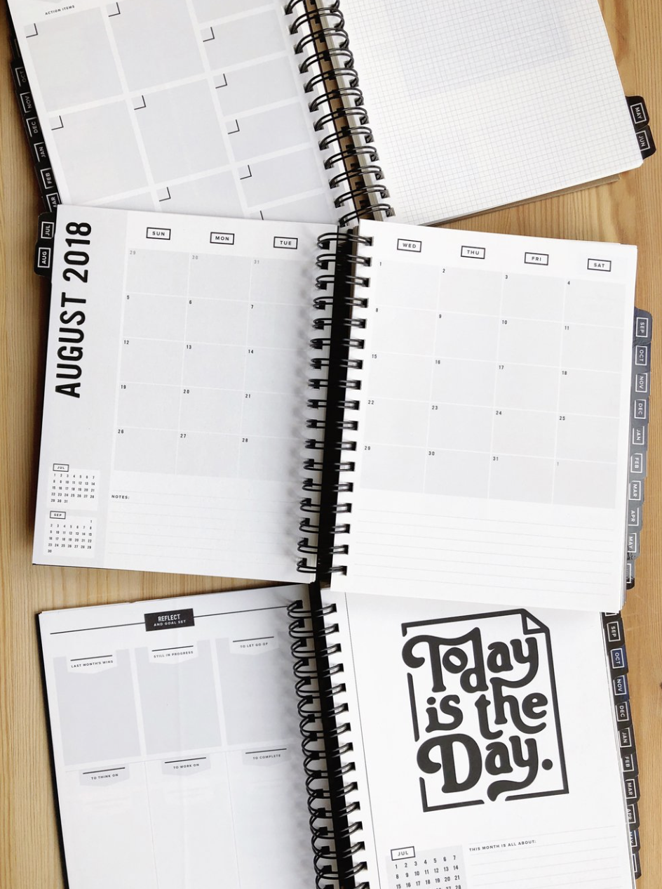
Weekly Vertical layout. This is just how my mind thinks about the week. I don’t like the horizontal layouts and I don’t need a daily layout. It’s also important for me to have a spread of the whole month. This is mostly standard, but not entirely.
Tabs. My current Nomatic planner does not have tabs for months or sections (though it does have three ribbon bookmarks that you can use however you want), but tabs would be helpful.
Customization. This is a want and not a need, but it really is cool how you can customize your own habit trackers and various sections of your personal planner these days. I am easily swayed by a monogram, and this is even better than that.
Style. This is a way bigger hiccup for me than I care to admit. It’s not that your planner is an extension of your truest soul or anything, but if it’s something you will be looking at every day, you don’t want to cringe, either. There’s a wide chasm between the cutesy, cheesy, mom-type planners, and then the all business, non-nonsense planners. It’s actually strangely hard to find a modern style I like. In many ways, planners are the new scrapbooking. (I had this exact same problem when I briefly fell into scrapbooking in the early 2000s.) There are TONS of embellishments out there, some that might even be useful, but they tend to be a swirly font flower explosion.
After many hours googling and following link after link of reviews and examples and on the various planner home pages themselves, I narrowed it down to these three popular choices:
Erin Condren Life Planner
Get To Work Book
Plum Paper
There were quite a few others suggested to me, but I ruled them out for various reasons:
Day Designer (which I’ve actually ordered before and is good quality and good style), but I don’t need a whole page for one day. I think in weeks and not days (typically). If a person really did need a daily planner, I do like the Day Designer.
Agendio. A ton of people messaged me about the fully customizable Agendio, especially after my friend Jamie Golden has been singing its praises all over the internet. I love all the customization, but the website is pretty overwhelming. I don’t think it’s a place to start for me. Maybe if I get really into the all-in-one planner thing I’ll approach an Agendio planner next year.
The Simplified Planner. I like the style of these but a) they are all sold out except the pineapple one (not for me) and b) the weekly version only has the horizontal layout while I prefer the vertical.
The Passion Planner. I love the layout of this planner! But alas, they do not offer the larger size I want. This is one that will stay in the running for me, though.
When I really forced myself to look at what I wanted and needed (instead of just clicking around on every pretty planner picture), the choice actually became pretty clear and it was a total surprise to me.
I really, really, really liked the Get To Work Book for two reasons: layout and style. Both of those are super important to me, and both of those the GTWB had (although I would have to add stickers or something to make the cover a little more personal). However, it’s not the size I wanted and there’s zero customization. Still, this is an excellent backup option for me if I don't love my final choice.
So that left my final choices between the Erin Condren and the Plum Paper. It started when I read this blog post. At that point, I had almost made a different decision. I had an Erin Condren Life Planner cover picked out and sitting in my cart. But then when I saw that the Plum Paper lets you add in custom sections for home, blog, social media, and fitness/health, that tipped me right on over the edge. To have EVERYTHING I’m managing truly all in one place was exactly the new system I wanted to try.
Plum Paper it is! At 2am, I finally clicked PURCHASE.
You can customize all these sections within the vertical weekly layout (choose the ME layout), and then add on sections with their own tabs.
Truthfully, I also preferred the style, colors, and fonts of the Plum Paper options. That wasn’t going to be the deal breaker, but it’s a bonus. Amidst all the customizations, here’s what I choose:
8.5x11 Lined Column Layout
Tropical Palm Leaf cover with my name at the bottom in Simple font in Fuchsia
Section Add ons:
My Home
Blog Planning
Social Media
Reflection
Dispersed Checklist Pages (one after each month)
I’m super excited about it and Plum Paper has already sent me an email saying it’s on the way.
Will it be too big and unruly as to be impractical? We shall see. I promise I’ll do an update in November/December, when most people will be looking to make a new purchase for the start of the next calendar year.
Thank you for indulging my planner mania. I am too old for this craziness.
UPDATE Six Months Later…
So here’s the deal about the Plum Paper Planner. I have used it for five months now and I love so many things about it. I love, love, love the customization options. I like the style and it does EXACTLY what I wanted it to do when I ordered it.
But.
It’s too big for me. I ordered the 8.5x11 size with those add ons and it is ENORMOUS. I think if I worked in an office all day, it would be ideal. Or if I only kept it on my desk in a home office (which is what I thought I would do), then it would work great. However, at this stage in my life, I am just too mobile for that. I work at home some days, and some days at a co-working space. I meet people at coffee shops or at their offices, so I have to put this thing in my tote or purse and it is just ginormous. My laptop is tiny and thin, i’ve worked hard to keep other things minimalist in my bags and this thing just wrecks all that. So then I’ve taken to not bringing it with me, which means I have Digital notes in my phone and wherever and it’s just not streamlined. It’s inconvenient.
I was hoping maybe Plum Paper planners offered a six month option to make it half as thin (I’m open to ordered twice a year) and then I would eliminate the add-ons sections. But they don’t offer that, their planners start at 12 months. (A nice bonus, though, is that you can start on any month, so you don’t have to wait for January or August to order a new planner.) Now, they DO offer to send you pages unbound in the coil, so you could three-hole punch it into your own slim binder and have only 3-6 months at a time. But that’s not really what I’m going for, so I won’t be doing that.
So I bought the larger sized Moleskine to go back to that, I just felt like I was out of options. And then…THEN I saw Plum Paper was having a sale and I took a risk and ordered the next size down - I ordered the 7x9 size - even though I was concerned it was big enough for everything. I put zero add-ons in it this time.
It arrived and MAYBE I’VE FOUND MY HOLY GRAIL PLANNER.
I am so, so excited about it. It’s not too small, and it’s very light. Still the same great quality and custom options, in fact I actually changed the layout to the PRIORITY layout (which might be new, I don’t recall seeing it when I was building the first planner last summer). I also went with monochromatic instead of colorful this time.
Listen, sometimes it takes some trial and error to find what you need. I’ll check back in (again) in another six months, but for now i’m pretty hopeful that this is my life in a planner.
